In about September 2005, the IRS released statistics on income drawn from tax returns through 2003 (an updated version of the statistics can be found at http://www.irs.gov/pub/irs-soi/05in05tr.xls). In October 2005, Rush Limbaugh posted an article on his website titled "The Top 50% pay 96.54% of All Income Taxes" which addressed these statistics. This was an update of an article titled "Only the Rich Pay Taxes" which dates back to at least 2002.
Rush begins the article as follows:
This is the data for calendar year 2003 just released in October 2005 by the Internal Revenue Service. The share of total income taxes paid by the top 1% of wage earners rose to 34.27% from 33.71% in 2002. Their income share (not just wages) rose from 16.12% to 16.77%. However, their average tax rate actually dropped from 27.25% down to 24.31%
Think of it this way: less than 3-1/2 dollars out of every $100 paid in income taxes in the United States is paid by someone in the bottom 50% of wage earners. Are the top half millionaires? Noooo, more like "thousandaires." The top 50% were those individuals or couples filing jointly who earned $29,019 and up in 2003. (The top 1% earned $295,495-plus.) Americans who want to are continuing to improve their lives, and those who don't want to, aren't.
The above statistics could well have the effect of angering anyone who makes more than $29,019 since it implies that they are helping to pay for the lower 50 percent of wage-earners. In fact, this is an example of the misleading use of averages. Following is a summary of the IRS data being cited by Rush:
PERCENT OF INCOME EARNED AND TAXES PAID BY SELECTED CUMULATIVE PERCENTILES

                                 Top 50   Top 25   Top 10    Top 5    Top 1
Percent share of...      Total  Percent  Percent  Percent  Percent  Percent
----------------------------------------------------------------------------
Adjusted gross income   100.00    86.01    64.86    42.36    31.18    16.77
Total income tax.....   100.00    96.54    83.88    65.84    54.36    34.27
Population...........   100.00    50.00    25.00    10.00     5.00     1.00
AGI floor ($thousand)      N/A    29.02    57.34    94.89   130.08   295.50
As can be seen, the upper 50 percent of wage earners, who earn about $29 thousand and above, did pay 96.54% of all income taxes. Now, following are the same numbers, divided up into distinct percentile groups:
PERCENT OF INCOME EARNED AND TAXES PAID OF SELECTED DISTINCT PERCENTILES

                          0-50    50-75    75-90    90-95    95-99    Top 1
Percent share of...    Percent  Percent  Percent  Percent  Percent  Percent
----------------------------------------------------------------------------
Adjusted gross income    13.99    21.15    22.50    11.18    14.41    16.77
Total income tax.....     3.46    12.65    18.04    11.48    20.09    34.27
Population...........    50.00    25.00    15.00     5.00     4.00     1.00
AGI floor ($thousand)      N/A    29.02    57.34    94.89   130.08   295.50
As can be seen, the lower half of this "oppressed group", the 50 to 75 percentile, actually pays only 12.65 percent of all income taxes despite the fact that they make up 25 percent of the population. The next group, the 75 to 90 percentile, pays about 18 percent of all income taxes, slightly more than their 15 percent share of the population. However, the 18 percent is still less than their 22.5 percent share of income and is therefore less than they would pay under a flat tax. The next group, the 90 to 95 percentile, pays 11.48 percent of all income taxes, slightly more than their 11.18 percent share of income. Hence, it is primarily the top five percent of taxpayers, those making over $130 thousand, who pay more than they would under a flat tax, making up for the lower 90 percent, who pay less. This is a far cry from the upper half of taxpayers, those making over $29 thousand, referred to by Rush.
Rush goes on to list the share of income taxes paid and adjusted gross income earned by each cumulative percentile listed in the first table above. He also gives the prior year's figures in parentheses. As mentioned above, the cumulative percentiles do not give any information about what is going on in the distinct percentiles since every cumulative percentile contains the top one percent. In addition, it is a somewhat laborious task to then compare the share of income taxes paid and income earned by each distinct percentile as I did in the last paragraph. An easier method is to look at the average tax rate, also given in the IRS statistics. This is computed by dividing the total income tax paid by the total income earned of each percentile and hence takes both numbers into account. One can then compare these the average tax rate of each percentile to the average tax rate of all taxpayers to see which percentiles are paying more and which are paying less than the average.
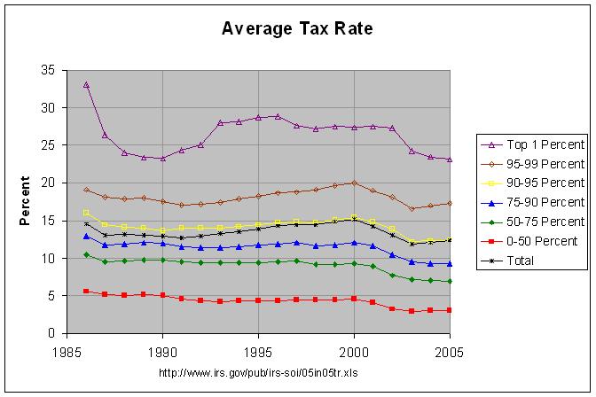
The following graph shows the average tax rate of all taxpayers and each distinct percentile from 1986 through 2005:
The actual numbers and sources are at this link. As can be seen, the top one percent and 95-99 percentile pay a clearly higher average tax rate and the 90-95 percentile pays a slightly higher average tax rate than the average tax rate of all taxpayers. All other percentiles pay a clearly lower average tax rate. This agrees with the analysis above. However, the graph shows that this general relationship has continued since at least 1986.
There are a couple of other items of interest apparent in the graph. One is that the average tax rate paid by the top one percent dropped sharply from 1986 to 1988. This followed the Tax Reform Act of 1986 which lowered the top marginal rate from 50 to 28 percent. Another item is that the average tax rates of all percentiles except for the top one percent dropped steadily from 2000 to 2003, following the tax cut of 2001 which phased in a lowering of individual tax rates. The average tax rate of the top one percent, however, stayed fairly steady through 2002 after which it dropped sharply. The explanation for this likely is due to the fact that the top one percent get a significant amount of income from capital gains which is taxed at a lower rate than ordinary income. Income from capital gains dropped sharply following the slump in the market starting in 2001 and this caused a higher percentage of the income earned by the top one percent to be taxed at the higher rate. This appears to have offset the affect of the phased-in cut in tax rates. However, by 2003 the market had begun to recover, increasing income from capital gains. In addition, the tax cut of 2003 lowered the top tax rate on capital gains and dividends.
Rush concludes:
I have made an executive decision as the owner and ultimate editor of this website that this table and these numbers stay on this website forever - updated when each year's numbers come out, of course. In order to get these facts, you have to see them each and every day. This story, along with a link to the IRS chart, will stay somewhere on the RushLimbaugh.com homepage so everyone can see and find these numbers at any time. It's crucial that people get this, so please, share it with a friend now!
Despite Rush's pledge to keep the numbers on his website forever and update them when each year's numbers come out, the article referenced by this response is two years out of date and I have not been able to find an updated version on his website. In any case, just as Rush suggests that you share his article, likewise feel free to post this response and/or share it with a friend!