A March 16th New York Times editorial titled Through Bush-Colored Glasses alleged that Bush painted a false picture of the economy in a recent speech. Following is an excerpt:
Mr. Bush boasted about 52 consecutive months of job growth during his presidency. What matters is the magnitude of growth, not ticks on a calendar. The economic expansion under Mr. Bush — which it is safe to assume is now over — produced job growth of 4.2 percent. That is the worst performance over a business cycle since the government started keeping track in 1945.
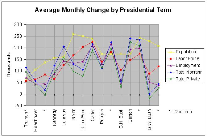
I haven't calculated the job growth per business cycle but I have looked at the growth in employment over every presidential term since 1949. The following table shows the monthly average change in population, the labor force, employment according to the Household Survey, total nonfarm employment, and total private employment over every presidential term since 1949, along with the unemployment rate at the beginning of each term:
CHANGE IN POPULATION, LABOR FORCE, AND EMPLOYMENT BY PRESIDENTIAL TERM (in thousands)

                     Monthly Average Change (in thousands)
                     --------------------------------------------          Unemploy-
                        Popu-    Labor Househld  Nonfarm  Private   No. of      ment
President    Mo Year   lation    Force   Survey Employed Employed   Months      Rate
----------- --- ---- -------- -------- -------- -------- -------- -------- ---------
Roosevelt   Jan 1941                               154.6    117.4       48
Truman      Jan 1945                                57.8     65.3       48
  "         Jan 1949     63.9     55.6     71.4    114.0     95.2       48       4.3
Eisenhower  Jan 1953    104.8     62.3     42.3     57.1     39.9       48       2.9
  "         Jan 1957    136.0     83.7     44.7     16.6     -3.1       48       4.2
Kennedy     Jan 1961    156.1     65.0     87.9    122.9     94.3       48       6.6
Johnson     Jan 1965    159.9    124.0    141.8    205.3    158.0       48       4.9
Nixon       Jan 1969    258.3    165.9    132.4    128.8     97.9       48       3.4
Nixon/Ford  Jan 1973    249.3    202.5    141.0    105.7     77.2       48       4.9
Carter      Jan 1977    237.8    225.4    208.9    215.4    188.2       48       7.5
Reagan      Jan 1981    172.5    139.6    132.2    110.9    111.4       48       7.5
  "         Jan 1985    172.1    180.5    216.8    224.6    194.6       48       7.3
G.H. Bush   Jan 1989    173.3    104.4     49.3     54.0     30.5       48       5.4
Clinton     Jan 1993    173.4    147.0    192.1    239.7    225.3       48       7.3
  "         Jan 1997    241.7    173.8    197.5    234.1    208.3       48       5.3
G.W. Bush   Jan 2001    228.1     87.6     51.4      0.6    -18.6       48       4.2
  "         Jan 2005    206.3    119.0     38.6     43.4     27.1       48       5.2
            Jan 2009                                                             7.6
Following is a graphical representation of the above numbers:
Additional numbers and the sources can be found at this link. As explained in my post of March 16th, one must be careful in comparing changes in employment using the Household Survey. This extends to changes in the population and labor force, also from the Household Survey. Still, the job growth of nonfarm and private jobs (from the Payroll Survey) in Bush's first term was the worst since at least 1941. Taking both of Bush's terms together, the average monthly growth in household survey, nonfarm, and private employment were 45.0, 22.0, and 4.2 thousand, respectively. The household survey numbers are the worst since Eisenhower and the nonfarm and private employment numbers are the worst since at least 1941.
The above graph and table show at least one other interesting fact. They show 15 presidential terms since 1949. In almost every term of a Democratic president, the growth in household survey, nonfarm, and private employment was greater than the growth in the labor force. Conversely, in almost every term of a Republican president, the growth in household survey, nonfarm, and private employment was less than the growth in the labor force. The only two exceptions in the 15 terms were Carter and Reagan's second term.
A related fact is that the unemployment rate went down during almost every term of a Democratic president and up during almost every term of a Republican president since 1949. This follows from the prior fact because the unemployment rate equals the unemployed (labor force minus the employed) divided by the labor force from the Household Survey. In any case, the only exceptions to this second fact was Carter (when the unemployment rate stayed about the same) and both terms of Reagan. Of course, the unemployment rate is doubtlessly affected by the majorities of both houses and many other facts. Still, this apparent relationship to the party of the current president would seem worthy of some additional study.
A reader of the above analysis suggested that it takes time for an economic policy to have an effect and that the analysis of the effect of a president's policy should be lagged by two years. While the idea that some effects of a policy require a two-year lag has merit, I know of no evidence that all effects require the passage of two years to begin. Some effects may begin as soon the the election result or the passage of certain policies becomes known. Hence, the following table shows annual job growth with a one-year and two-year time lag as well as no time lag. In addition, it shows job growth if the first two years of a president's term are skipped, assuming that they are effected by both the prior and current president's policies. So as to skip as little time as possible, the table looks at job growth by party, combining consecutive terms where the presidency is held by the same party.
    NONFARM AND HOUSEHOLD SURVEY EMPLOYMENT GROWTH BY PRESIDENTIAL PARTY (percent annualized)

                     Nonfarm Employment Growth           Household Survey Employment Growth
                     ----------------------------------- -----------------------------------
                                1-Year   2-Year   2-Year            1-Year   2-Year   2-Year
President    Mo Year   No Lag      Lag      Lag^    Skip^  No Lag      Lag      Lag     Skip Party
----------- --- ---- -------- -------- -------- -------- -------- -------- -------- -------- -----
Roosevelt   Jan 1941      3.2      2.1      1.3      1.7                                      Dem
Truman      Jan 1945
  "         Jan 1949                                          1.4      1.0      0.5      1.6  Dem
Eisenhower  Jan 1953      0.9      1.3      1.6      1.4      0.8      1.2      1.2      1.3  Rep
  "         Jan 1957
Kennedy     Jan 1961      3.3      3.3      3.0      3.6      2.0      2.2      2.0      2.3  Dem
Johnson     Jan 1965
Nixon       Jan 1969      1.9      2.2      2.9      2.2      2.0      2.3      2.7      2.2  Rep
Nixon/Ford  Jan 1973
Carter      Jan 1977      3.1      1.7      0.0      1.2      2.7      1.4      0.3      1.0  Dem
Reagan      Jan 1981      1.6      1.8      2.3      2.1      1.5      1.7      1.9      1.8  Rep
  "         Jan 1985
G.H. Bush   Jan 1989
Clinton     Jan 1993      2.4      1.9      1.4      2.2      1.8      1.3      1.2      1.7  Dem
  "         Jan 1997
G.W. Bush   Jan 2001      0.2      0.4      0.5      0.5      0.4      0.7      0.6      0.6  Rep
  "         Jan 2005
            Jan 2009

All Democrats             3.0      2.3      1.6      2.3      2.0      1.6      1.2      1.8
All Republicans           1.2      1.5      1.9      1.6      1.2      1.5      1.7      1.5
The sources of these numbers can be found at this link. The bottom two lines show the average annual job growth for each party since 1941 for nonfarm employment and 1949 for household survey employment. As can be seen, Democrats hold a wide margin with no time lag and a smaller margin with a one-year time lag or ignoring the first two years. However, Republicans hold a small margin with a two-year time lag. It would seem that skipping the first two years might be the most reasonable number to look at as it makes no assumptions about which president's policy has the largest effect during this period. Still, the relatively large difference caused by lagging the data by one or two years would seem to merit additional study. To that end, the following graph displays this and other employment data over these periods:
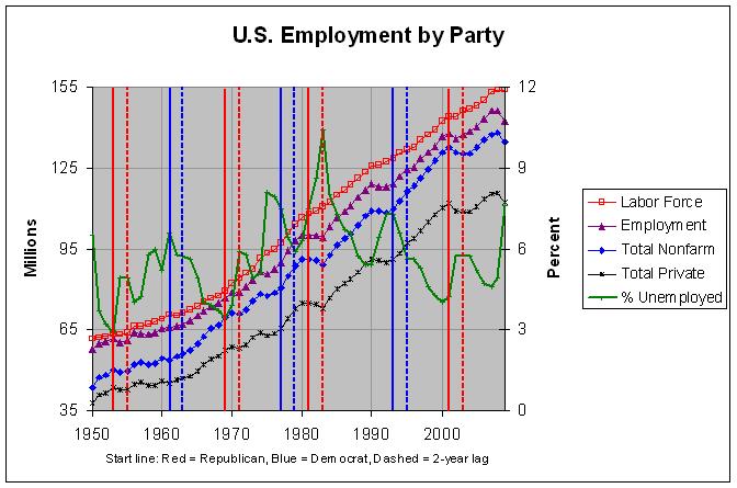
As can be seen, there was a steep jump in the unemployment rate during the first two years of every one of the four Republican periods corresponding to the recessions that began in 1953, 1970, 1981, and 2001. In addition, there was a drop in the unemployment rate during the first two years of every one of the three Democrat periods corresponding to the recoveries from the recessions that ended in 1961, 1975, and 1991. Lagging the data by two years causes all of these periods to be attributed to the other party. Hence, much of the Democrats' advantage in job growth appears to be due to recessions that occurred at the beginning of Republican presidential terms. For this reason, it makes sense to look at the job growth numbers for each party over an entire business cycle.
The following table attempts to look at job growth under each party over entire business cycles:
           NONFARM AND HOUSEHOLD SURVEY EMPLOYMENT GROWTH BY BUSINESS CYCLE
                (percent annualized over specified span of years)

                     Nonfarm Employment Growth        Household Survey Employment Growth
                     ---------------------------      ----------------------------------
                       Peak    Trough   Trough             Peak    Trough   Trough
President       Year to Peak  to Peak  to Trough         to Peak  to Peak  to Trough
--------------- ---- -------- -------- ---------         -------- -------- ---------
                     45-53    46-53    46-54
Truman          1945      2.3      3.3      2.7
                     53-60    54-60    54-61             53-60    54-60    54-61
Eisenhower      1953      1.1      1.6      1.2               0.8      1.4      1.3
                     60-70    61-70    61-71             60-70    61-70    61-71
Kennedy/Johnson 1961      2.7      3.2      2.8               1.9      2.0      1.8
                     70-74    71-74    71-75             70-74    71-74    71-75
Nixon           1969      2.3      3.3      2.2               2.4      3.2      2.1
                     74-81    75-81    75-83             74-81    75-81    75-83
Ford/Carter     1973      2.2      2.8      1.8               2.1      2.6      1.9
                     81-90    83-90    83-92             81-90    83-90    83-92
Reagan/Bush     1981      2.0      3.0      2.2               2.0      2.6      1.9
                     90-01    92-01    92-03             90-01    92-01    92-03
Clinton         1993      1.8      2.3      1.7               1.3      1.7      1.4
                     01-08    03-08    03-09             01-08    03-08    03-09
G.W. Bush       2001      0.6      1.2      0.5               0.9      1.3      0.6
As before, the sources of these numbers can be found at this link. The table shows the average annual job growth over entire business cycles for each party since 1945 for nonfarm employment and 1953 for household survey employment. It shows it both from peak to peak and from trough to trough. The peaks and troughs are those observed from Nonfarm Employment and are nearly all within 6 months of the peaks and troughs for business cycle expansions and contractions given by the National Bureau of Economic Research (NBER) at http://www.nber.org/cycles/cyclesmain.html. The exceptions are January 1992 (10 months after March 1991), January 2003 (14 months after November 2001), and January 2009 (NBER has not yet indicated a trough after December 2007). In any case, the table also shows the job growth from the trough to peak to give some measure of the maximum job growth during the business cycle.
The trough to trough values tend to better match the presidential terms and are likely the better ones to use. The one exception is G.W. Bush for which the year and values of the ending trough have not yet occurred. This is a minor issue, however, as the other trough to trough values in the table tend to be very close to the corresponding peak to peak values. One other issue, however, is that the terms of Ford and Carter are combined since they were in the same business cycle.
Looking at nonfarm employment annual growth, the table shows it to have been highest under Truman and Kennedy/Johnson at about 2.7%, a bit lower under Nixon and Reagan/Bush at 2.2%, a bit lower still under Ford/Carter and Clinton at about 1.8%, lower under Eisenhower at 1.2%, and by far the worse under G.W. Bush at 0.6%. Even the maximum job growth under G.W. Bush has been just 1.2%.
Looking at Household Survey employment growth, the table shows it to have been highest under Nixon at 2.1%, very slightly lower under Kennedy/Johnson, Ford/Carter, and Reagan/Bush at about 1.9%, a bit lower under Eisenhower and Clinton at about 1.3%, and lowest under G.W. Bush at 0.9%.
It's always possible that certain policies may have some effect on the business cycle. Still, the difference in job growth between the two parties does greatly lessen, if not disappear, if one looks at job growth over entire business cycles. The one major difference that remains is that job growth has been very poor under G.W. Bush. Hence, it appears that the contention in the aforementioned New York Times editorial that job growth under Bush is the "worst performance over a business cycle since the government started keeping track in 1945" is correct.